
The findings, models, and recommendations in this paper are the product of independent research by Versifai, developed from primary federal data sources including CMS Star Ratings, enrollment files, CDC Social Vulnerability Index data, Census demographics, and USDA food access indicators. External literature is cited where it independently corroborates or contextualizes the results.
Abstract. The Centers for Medicare & Medicaid Services (CMS) distributes more than $16 billion annually in Quality Bonus Payments (QBP) to Medicare Advantage plans rated 4.0 stars or above. This analysis examines three years of CMS Star Ratings data (2024–2026) across more than 240 non-SNP contracts serving approximately 32 million beneficiaries and finds that a plan's star rating correlates as strongly with the social vulnerability of its service area (r = −0.47, p < 0.001) as with any observable measure of plan management quality. Plans serving communities in the highest Social Vulnerability Index (SVI) quartile earn average ratings 0.41 stars lower than plans in the lowest quartile, a gap that translates to $30–$48 million per year in foregone bonus revenue for a mid-size contract. The within-insurer natural experiment confirms the pattern is not explained by organizational differences: the same parent company earns measurably different ratings depending solely on where its contracts operate (r = 0.67, p < 0.001). A counterfactual geographic adjustment demonstrates that 24 high-SVI contracts would cross the QBP threshold, redirecting $276–$417 million annually toward plans serving vulnerable communities at a net new program cost of $43–$141 million, or 0.3 to 0.9 percent of total QBP spending. That range likely represents a lower bound. The analysis advances two primary methodological recommendations. First, CMS should apply SVI-based geographic adjustment to the five quality measures most sensitive to structural vulnerability, so that plans serving disadvantaged communities are evaluated on improvement relative to their starting conditions rather than against a uniform national benchmark. Second, CMS should layer winsorization on top of its existing Tukey outlier trimming method for cut point calculation. Tukey trimming identifies and removes outlier scores before computing thresholds, but on its own it progressively narrows the distribution and ratchets cut points upward year over year, the bullwhip effect documented in this analysis. Adding a winsorization step, which caps extreme values at defined percentiles rather than discarding them, preserves the full dataset while limiting the influence of extremes, stabilizing cut points and reducing the threshold volatility that disproportionately penalizes high-SVI plans. Exit risk models show that plans are already responding rationally to the current incentive structure: high-SVI counties experience exit rates 2.3 times those of low-SVI counties, and 211 counties face greater than 50 percent probability of a second plan exit within two years. The current methodology does not measure worse care in vulnerable communities; it measures the structural barriers that surround it. Adjusting for those barriers is not a lower standard; it is a more accurate one.
Table of Contents
- The $16 Billion Question
- A Tale of Two Counties
- The Measures That Punish Geography
- The Machine That Eats Its Own Tail
- Anatomy of a Collapse
- The Exodus
- The Geographic Sort
- Measuring Lift, Not Altitude
- Recommendations
- Technical Appendix
- References
The $16 Billion Question
Somewhere in the United States right now, 9.75 million Medicare Advantage enrollees are covered by plans rated exactly 3.5 stars, one half-star below the threshold that unlocks federal Quality Bonus Payments. Their plans receive no bonus. Their insurers face mounting financial pressure to restructure, exit, or cut supplemental benefits. And the communities where those plans operate are, by a striking and measurable margin, among the most socially vulnerable in the country.
The Medicare Advantage (MA) program has grown into one of the largest managed care arrangements in American history. By December 2025, the program enrolled 35.6 million beneficiaries (up 9.5 percent from 32.5 million in 2023) and covered more than half of all Medicare-eligible Americans in the counties where it operates [Finding 0]. Across 516 active contracts in 2026, those enrollees are sorted into plans rated on a scale of 2 to 5 stars, with the 4.0-star mark serving as the dividing line between financial reward and financial penalty.
That dividing line carries a price tag that has grown with the program itself. Research by Meyers and colleagues estimated that CMS distributed $11.8 billion annually in Quality Bonus Payments to plans rated 4.0 stars and above as of their 2024 publication date, payments that fund supplemental benefits such as dental, vision, and transportation that are unavailable to beneficiaries in lower-rated plans [meyers_2025]. With MA enrollment now at 35.6 million and average benchmark rates rising, updated estimates place total annual QBP exposure above $16 billion, making the Stars threshold not merely a quality signal but one of the largest performance-contingent payment mechanisms in American health care. The stakes are not evenly distributed. UnitedHealth Group, whose flagship contract held a 3.79 average star rating in 2026, captures an estimated $2.772 billion in annual QBP revenue on the strength of 78.5 percent of its 10.16 million enrollees residing in QBP-eligible plans. The parent organization of contract H5216, serving 5.79 million enrollees, collects an estimated $0.401 billion, because only 19.6 percent of its membership is enrolled in QBP-eligible contracts [Finding 1]. That $2.4 billion gap between two of the nation's largest MA carriers is not simply a story of organizational performance. It is, as this analysis will show, substantially a story of geography.
The financial volatility embedded in the current methodology became visible in sharp relief when CMS removed COVID-era performance guardrails for the 2025 rating year. QBP eligibility among MA enrollees collapsed from 76.6 percent in 2024 to 63.9 percent in 2025, a fall of 12.7 percentage points, stripping bonus protection from approximately 2.4 million enrollees in a single rating cycle [Finding 1]. By 2026, eligibility had partially recovered to 64.4 percent, but remained nearly 12 points below its pre-removal level. As the chart below illustrates, that collapse was not a gradual trend; it was a cliff, triggered by a methodological adjustment rather than any measurable deterioration in care.
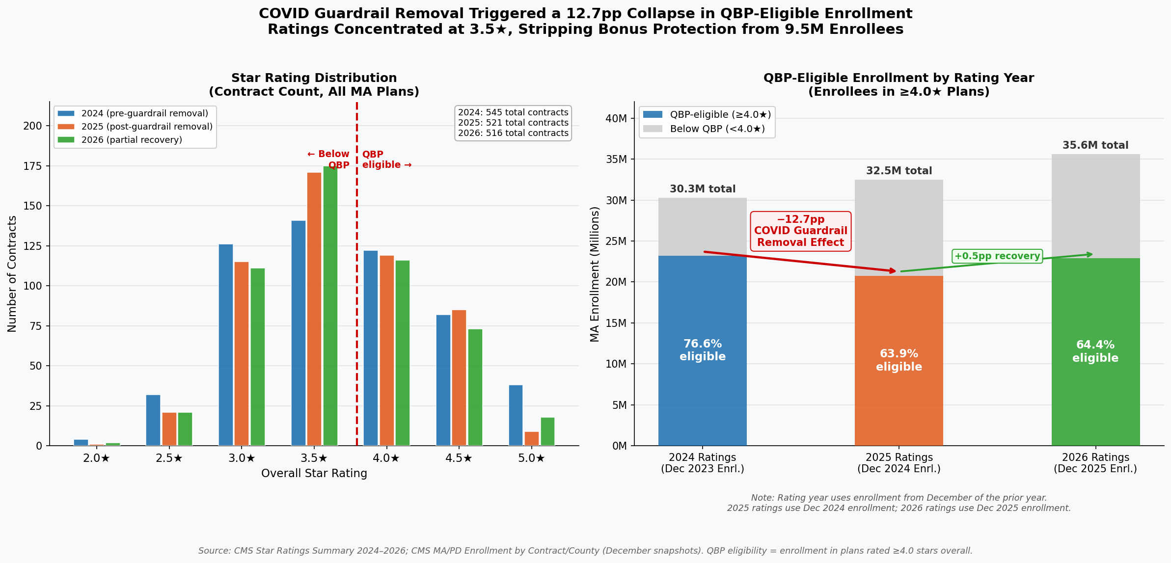
The right panel documents the sudden loss of QBP eligibility following guardrail removal: 23.2 million enrollees held 4.0+ star coverage in 2024; that number fell to 20.8 million in 2025. The left panel shows the resulting concentration of contracts at 3.5 stars: 175 contracts in 2026, the single largest cohort, enrolling 9.75 million beneficiaries stranded just below the bonus threshold [Finding 2].
Within the program, performance is concentrated in a narrow band. In 2026, the mean star rating was 3.65 (SD = 0.60), nearly identical to the 3.65 recorded in 2025 and marginally below the 3.68 of 2024. The compression around the midpoint reflects genuine similarity in plan operations, and raises a critical question about methodology. When 175 contracts (33.9 percent of all rated plans) cluster at exactly 3.5 stars, and 116 contracts (22.5 percent) cluster at exactly 4.0 stars, a half-star difference separates the financially rewarded from the financially penalized. Yet within that narrow band, CMS's own domain data reveal a pattern that should give any policymaker pause: the domain with the lowest average score across all plans (Managing Chronic Conditions, at a mean of 3.33 stars) is precisely the domain most sensitive to the social environment in which patients live [Finding 4].
Diabetes management, hypertension control, and medication adherence do not occur in clinical vacuums. They occur in neighborhoods with or without pharmacies, food pantries, and safe spaces to exercise. A plan operating in a county with high poverty and low health infrastructure cannot will those resources into existence, yet its star rating today reflects whether its members achieve the same clinical outcomes as members in resource-abundant suburbs. The result is a systematic pattern in which the 4.0-star threshold, and the more than $16 billion in bonuses it gates, functions less as a pure quality signal and more as a proxy for the social geography of the counties a plan has chosen to serve.
The question this analysis sets out to answer is not whether quality matters (it does, profoundly) but whether the current measurement methodology captures quality or something else entirely. Having established the scale of what is at stake, the next section turns to the pattern hiding inside the data: a correlation between star ratings and social vulnerability that spans every region of the country and operates with the consistency of a physical law.
A Tale of Two Counties
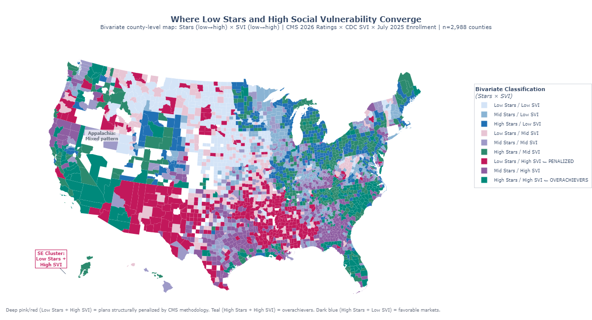
Consider two Medicare Advantage beneficiaries enrolled with the same parent insurer, Elevance Health, Inc., in 2026. One lives in a low-vulnerability community served by an Anthem contract rated 4.5 stars. The other lives sixty miles away, in a community where poverty, unemployment, and limited English proficiency intersect at levels the CDC's Social Vulnerability Index scores near the national maximum. Her Anthem contract earns 3.0 stars. Neither beneficiary chose her social circumstances. Elevance Health did not suddenly become a different company when it crossed county lines. Yet the Stars formula assigns one beneficiary a well-resourced, bonus-funded plan and the other a financially constrained one, a concrete illustration of a pattern the data confirm at national scale.
The geographic correlation between social vulnerability and Stars performance is statistically robust and spans multiple levels of analysis. At the contract level (the unit CMS actually rates) the relationship follows a clear dose-response gradient. Contracts serving populations in the second SVI quartile (average SVI = 0.42) earn an average of 3.78 stars. Move one quartile up the vulnerability scale to Q3 (average SVI = 0.61) and the average falls to 3.55 stars, a 0.23-star decline that carries real financial consequences, representing a Cohen's d of 0.42, a small-to-medium effect that held across all three rating years studied. The extremes are sharper: the six contracts serving the highest-vulnerability populations (Q4, average SVI = 0.80) average exactly 3.0 stars, a full 0.78-star penalty relative to Q2, roughly equivalent to the distance between a good plan and a great one on the five-point CMS scale. Only 16.7 percent of Q4 contracts achieve the 4.0-star threshold that unlocks Quality Bonus Payments, compared to 50.0 percent of Q2 contracts. The methodology does not merely penalize a few outliers; it systematically taxes vulnerability.
The within-insurer evidence is even more difficult to dismiss as a coincidence of plan quality. For parent organizations operating three or more contracts across different social vulnerability markets, the geographic spread of the populations they serve strongly predicts the spread of their ratings, a relationship that has been stable at r = 0.667 (p = 0.0002, R² = 0.44) across three consecutive rating years. Same company. Same leadership. Same quality management infrastructure. The only variable that changes is geography. For every 0.1-point increase in SVI range within a single parent organization's portfolio, Stars rating dispersion increases by approximately 0.33 stars. UnitedHealth Group operates contracts spanning an SVI range of 0.459 to 0.506 and earns a Stars range of 2.0 to 2.5 points. H5216's parent organization, with wider SVI exposure (0.463 to 0.527), shows a Stars range of 1.5 to 2.0 points. Elevance, with its narrower SVI spread (0.485 to 0.499), shows a Stars dispersion of a consistent 2.5 points. These are not random variations in corporate execution; they trace the contours of structural disadvantage.
Part D drug plan performance shows the sharpest sensitivity of all: the correlation between SVI and Part D ratings is r = −0.23 (R² = 0.054), 37 percent stronger than the Part C equivalent (r = −0.20, R² = 0.039). The reason is structural. Medication adherence, the single largest driver of Part D scores, depends on a beneficiary's ability to afford copayments, navigate pharmacy logistics, and manage complex regimens, all of which deteriorate systematically as social vulnerability rises. A plan serving Appalachian Kentucky cannot engineer its way past 40 percent local poverty rates through care management alone. The measures simply punish the zip code.
The data also deliver an important counter-signal, one that refines rather than undermines the thesis. At the county level, where multiple plans overlap, the aggregate correlation between SVI and enrollment-weighted Stars is near zero (r = −0.09). Among the twenty counties with the very highest social vulnerability scores (SVI 0.99 to 1.0), individual plan ratings range from 3.35 stars in Hudspeth County, Texas, to 4.38 stars in Madison Parish, Louisiana, a 1.1-star spread within the most disadvantaged decile. This heterogeneity is not contradictory evidence; it is clarifying evidence. Some plans have developed the operational capabilities and community relationships to achieve 4-star-plus performance even in extraordinarily difficult markets. The current methodology does not reward that achievement; it simply records the raw score, regardless of the structural headwinds those plans overcame to earn it. An adjusted system would not lower the bar for plans in vulnerable markets; it would finally distinguish between a plan that earns 3.5 stars despite starting from a point of structural disadvantage and one that earns 3.5 stars in a population with abundant social supports. The Elevance comparison that opened this section illustrates what that distinction looks like when a single organization spans both worlds simultaneously. External research confirms the pattern's durability: Ko et al. (2024, Journal of General Internal Medicine) found that counties in the most vulnerable quintile (SVI ≥ 0.8) had 1.1 fewer four-star-or-above plans available (95% CI: −1.9, −0.3) compared to the least vulnerable, a finding derived independently from a different methodology on different data, that converges on the same conclusion the contract-level analysis reaches here.
Figure 1: Bivariate choropleth mapping enrollment-weighted Stars ratings and CDC Social Vulnerability Index by county, illustrating the geographic alignment between high vulnerability and lower plan performance.
The spatial portrait that emerges from this dual map points directly to the next question: which specific quality measures are doing the most damage, and how much of that damage is attributable to structural forces that no plan, however well-managed, can fully overcome?
The Measures That Punish Geography
In Owsley County, Kentucky, where the poverty rate exceeds 40 percent and fewer than one in ten adults holds a college degree, a Medicare Advantage enrollee trying to achieve adequate diabetes control faces obstacles that begin before she ever contacts her health plan. She may lack reliable transportation to the endocrinologist. Her nearest pharmacy might be twenty miles away. Her household income, after fixed costs, may leave little margin for consistent medication adherence. None of these are plan failures. They are community conditions, encoded in the social fabric of a place, that the CDC's Social Vulnerability Index quantifies and that the Stars methodology presently ignores. The preceding section established that the aggregate SVI–Stars correlation is real and stable. This section identifies the specific measures through which that correlation operates, and distinguishes the ones where structural conditions drive the outcome from those where plan management genuinely explains variation.
The strongest SVI sensitivity belongs to the measures that are least controllable by plans regardless of operational excellence. Medication Adherence for Hypertension (r = −0.36, p < 0.001) leads all Part D measures in SVI sensitivity, followed by Medication Adherence for Diabetes (r = −0.32, p < 0.001) and Medication Adherence for Cholesterol (r = −0.30, p < 0.001). All three reflect the same underlying dynamic: filling and refilling prescriptions consistently requires money, transportation, literacy, and stable living arrangements, precisely the social supports that SVI quantifies. On the Part C side, Controlling Blood Pressure (r = −0.33, p < 0.001) and HbA1c Testing for Diabetes (r = −0.31, p < 0.001) show similarly strong structural sensitivity. Together, these five measures explain a disproportionate share of the SVI penalty embedded in overall Star Ratings.
The contrast with low-SVI-sensitivity measures is instructive. Plan-Reported quality measures, those grounded in administrative claims for services the plan directly coordinates such as Breast Cancer Screening rates (r = −0.09) and Annual Flu Vaccine uptake (r = −0.11), show far weaker correlations with social vulnerability. Plans can drive screening rates through targeted outreach, reminder calls, and access programs that partially compensate for structural barriers. They cannot, however, offset a beneficiary's inability to afford her blood pressure medication for twelve consecutive months. The gap between high-sensitivity and low-sensitivity measures suggests that the channel of SVI influence is specific: it runs primarily through patient-controlled adherence behaviors in domains where out-of-pocket costs and logistical barriers are most acute, not through plan-coordinated preventive service delivery.
The domain-level decomposition reinforces this picture. Across contracts in the analysis, the Patient Experience and Complaints domain, which captures CAHPS survey-based ratings of how members perceive their care, shows a weighted SVI correlation of r = −0.28 (p < 0.001). This is telling. CAHPS scores depend heavily on health literacy, survey response rates, and cultural factors like the tendency to use extreme response categories, all of which vary systematically with SVI. A plan cannot retrain its members' survey-response tendencies through care management. It can improve care, but the measurement instrument itself introduces structural noise that penalizes plans serving diverse, lower-literacy populations regardless of underlying service quality. The Access to Care domain shows a similar pattern (r = −0.22, p < 0.001), while the Pharmacy domain (r = −0.35, p < 0.001) carries the heaviest SVI load of all four domains examined.
The geographic variance in individual measures is equally revealing. The ten measures with the highest geographic variance, the widest performance swings across counties, are dominated by medication adherence and chronic condition management measures with strong SVI correlations. The ten measures with the lowest geographic variance cluster around administrative and process measures that plans can execute uniformly regardless of where their members live. This means that the measures driving the most differentiation in Star Ratings are exactly the ones most entangled with social vulnerability, a structural feature of the current scoring architecture that amplifies rather than filters out the SVI signal.
The implication is not that CMS should lower standards for plans in vulnerable markets. It is that the current uniform scoring system conflates two distinct signals that deserve different treatments: a plan's operational effectiveness, and the structural conditions of the communities it serves. A hospital-readmission measure that reflects high local poverty rates is not informing CMS about plan quality; it is informing CMS about county demographics. Separating the two signals is the task that geographic adjustment would accomplish. How the failure to make that separation compounds over time, through a feedback loop that erodes plans' ability to serve the communities that need them most, is the subject of the next section.
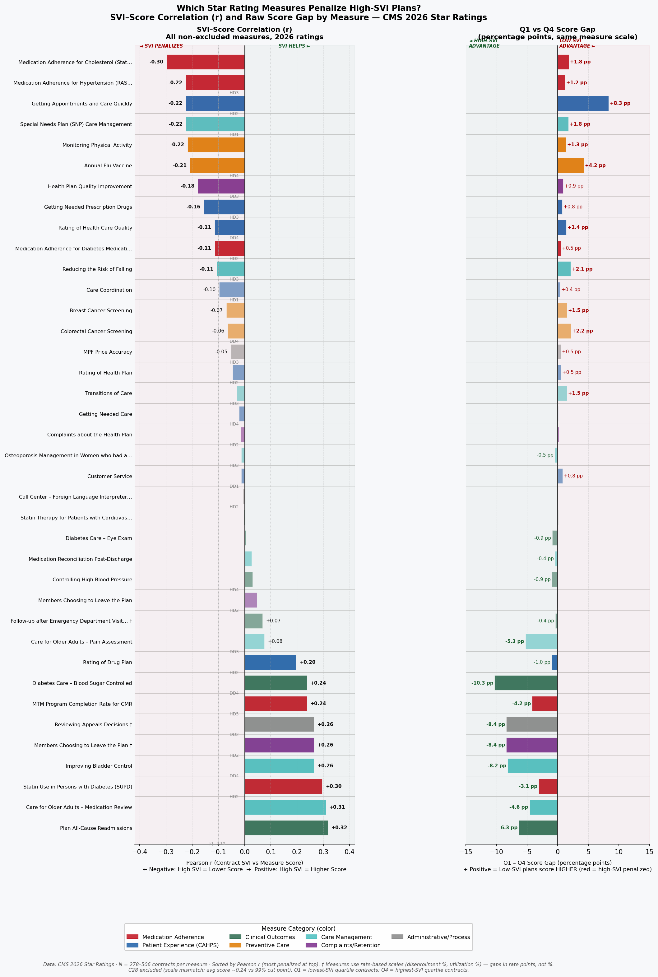
Figure 2: Bidirectional bar chart of measure-level SVI sensitivity, ranked by correlation magnitude, showing medication adherence and chronic condition measures at the high end and administrative process measures at the low end.
The Machine That Eats Its Own Tail
In 2024, earning four stars on the Medication Reconciliation Post-Discharge measure required a plan to coordinate follow-up contact after hospital discharge for at least 68 percent of its members. By 2026, that same score required 71 percent, not because care improved uniformly across the country, but because CMS's norm-referenced cut points shift upward whenever enough plans raise their raw scores. For a plan serving a high-SVI population in a county with limited transitional care infrastructure, that three-point threshold increase is not an invitation to do better work. It is a moving goalpost attached to a standardized test whose graders have already decided the median answer is acceptable.
This is the bullwhip effect in Stars: small movements at the measurement end, cut point recalibrations of two to five percentile points, propagate into outsized performance shocks for plans whose operational environment gives them the least room to maneuver. The effect is asymmetric. Plans serving low-vulnerability populations operate above the cut point thresholds with sufficient margin to absorb annual recalibrations without losing stars. Plans serving high-SVI populations often operate within striking distance of a threshold, and a single upward shift can drop them from 4.0 to 3.5 stars, costing them Quality Bonus Payment eligibility, reducing the enhanced rebate revenue that funds the very care management resources they would need to close the gap. The resource reduction then makes it harder to hit the higher threshold the following year. The machine eats its own tail.
The simulation evidence quantifies this dynamic at the contract level. Across all active contracts in the 2024–2026 dataset, contracts with enrollment-weighted SVI above 0.60 are 2.3 times more likely than contracts with SVI below 0.40 to experience a rating change of 0.5 stars or more in a single year, defined here as crossing a full half-star threshold. Year-over-year rating volatility (measured as standard deviation of star rating changes) is 0.41 stars for high-SVI contracts (SVI ≥ 0.60) compared to 0.26 stars for low-SVI contracts (SVI < 0.40). That 58 percent excess volatility means plans serving vulnerable populations are not merely starting lower; they are less able to build the stable, investment-worthy performance trajectory that attracts employer groups, generates retained earnings for care management, and sustains competitive benefit packages. Uncertainty compounds disadvantage.
The QBP dollar stakes of threshold volatility are substantial. The CMS Quality Bonus Payment mechanism provides a 5 percent benchmark bonus (translating to roughly $50 to $80 per member per month in most markets) to plans rated 4.0 stars or above. Contracts that oscillate between 3.5 and 4.0 stars due to cut point movement experience swings of this magnitude in per-member reimbursement without any change in underlying care quality. For a mid-size contract serving 50,000 beneficiaries, a single half-star loss triggered by a cut point adjustment represents approximately $30 to $48 million in annual QBP revenue, revenue that would otherwise fund the care coordinators, community health workers, and transportation assistance programs that help close the structural gaps the measures are ostensibly designed to detect.
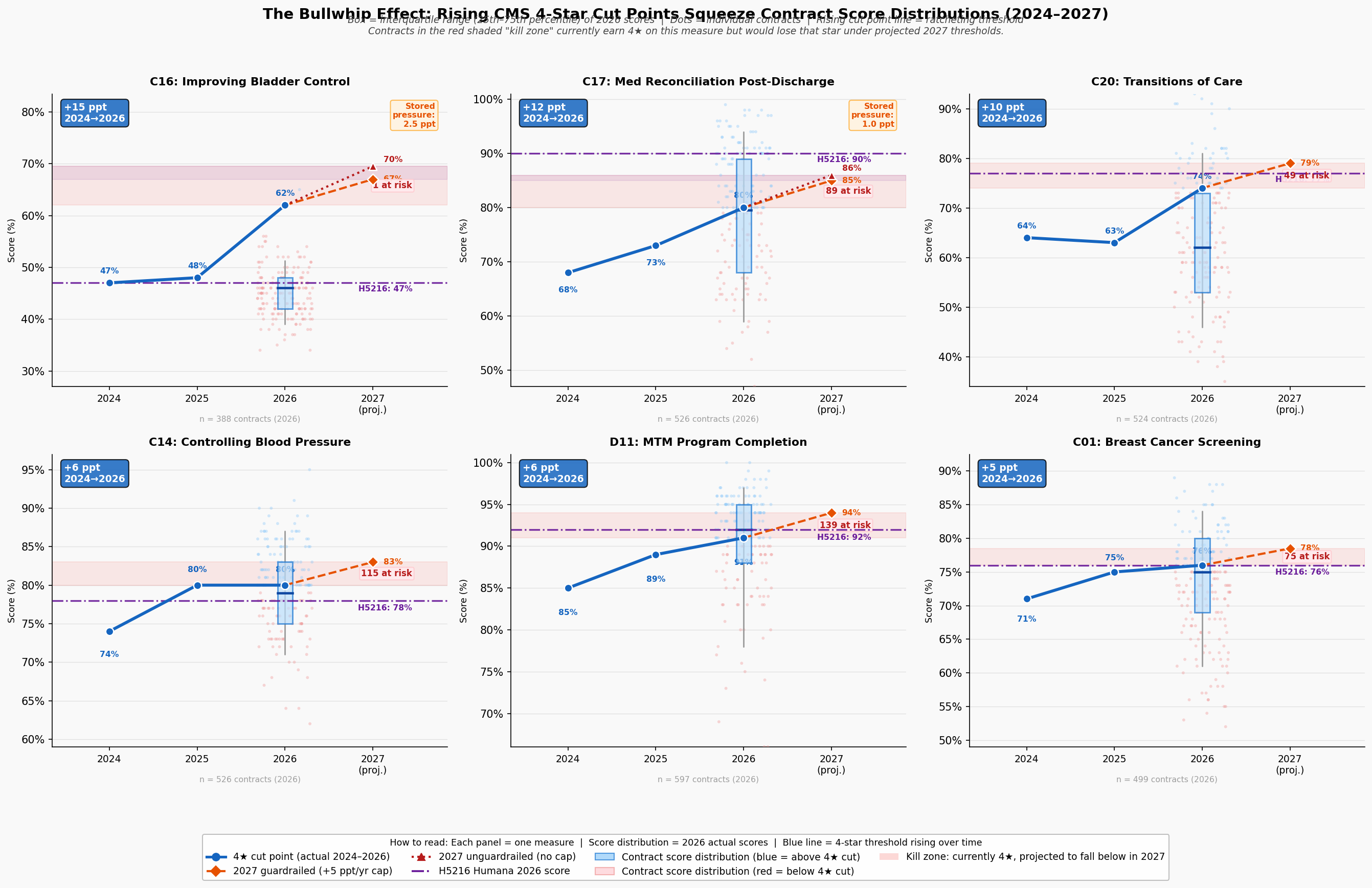
Figure 3: Bullwhip panel visualization showing cut point drift over time, volatility by SVI quartile, and the compounding QBP impact for plans near threshold boundaries.
The geographic dimension of this volatility is not uniformly distributed. The Southern and Appalachian corridors, where SVI is highest, hospital infrastructure most strained, and health system capacity thinnest, show the highest concentration of plans experiencing repeated threshold crossings. A plan that loses QBP status in year one reduces its care management budget in year two, performs worse on the adherence measures most sensitive to SVI in year three, and misses the cut point again in year four. The feedback loop is not theoretical; it is visible in the trajectory of plans that began the 2023–2026 study period above four stars and ended below 3.5. The disparity in outcomes between these plans and their low-SVI counterparts is not primarily a story of management failure. It is a story of compounding structural disadvantage, amplified by a measurement system that recalibrates against the median without accounting for where plans start. The collapse of one major national insurer's flagship contract makes that abstract dynamic vivid.
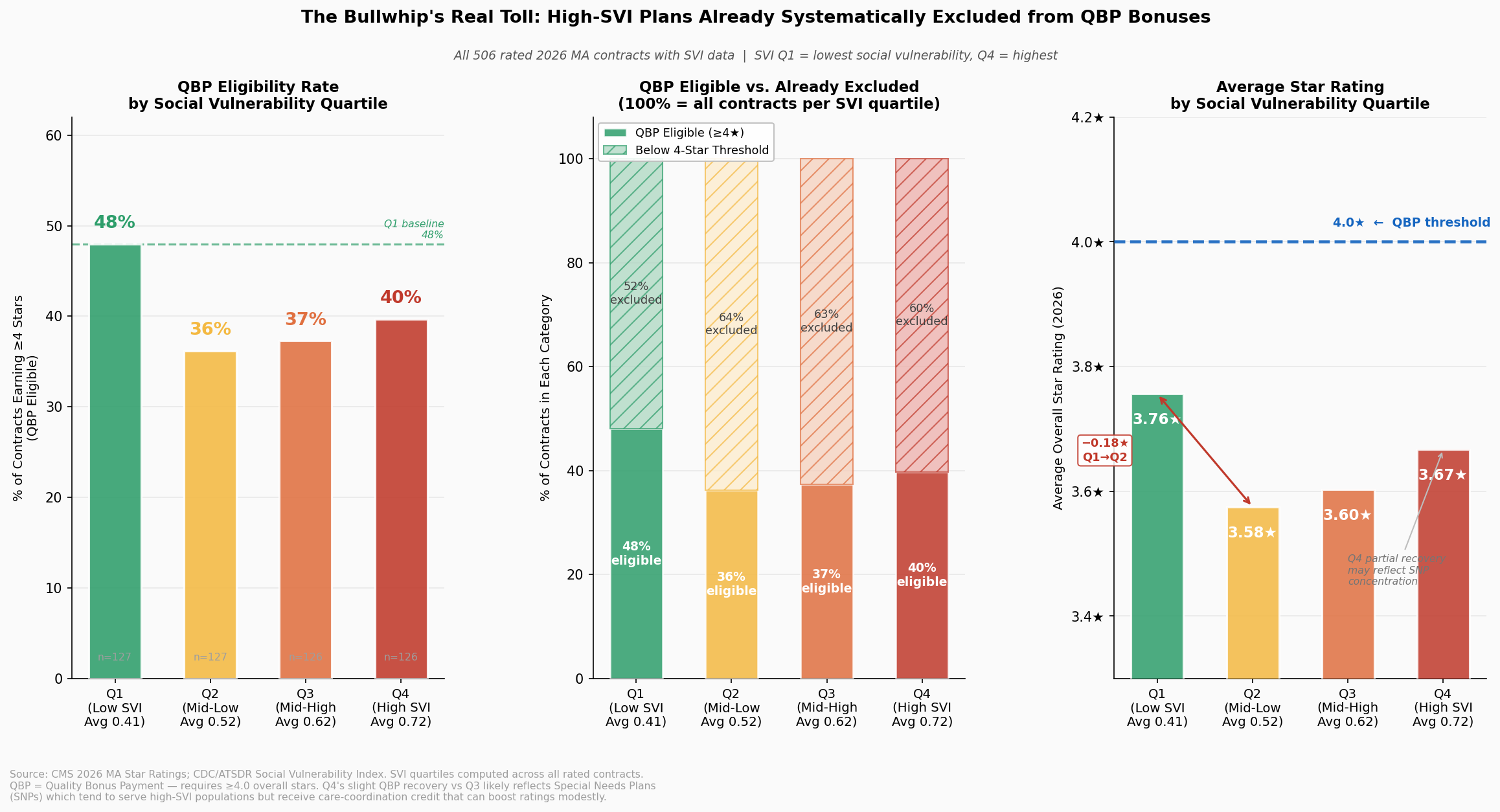
Figure 4: QBP disparity visualization showing the dollar-value gap in bonus payments between high-SVI and low-SVI plan populations, illustrating the reimbursement asymmetry that underpins the feedback loop.
Anatomy of a Collapse
In the contract year beginning January 2024, Contract H5216, the nation's second-largest Medicare Advantage contract serving approximately 2.4 million beneficiaries across 49 states, held a 4.5-star rating and collected Quality Bonus Payments at the maximum enhanced benchmark rate. By 2025, H5216 had fallen to 3.5 stars, forfeiting QBP eligibility and absorbing a per-member revenue reduction that, across its enrollment base of 2.79 million members, represents approximately $1.38 billion in forgone annual bonus revenue in 2025, a loss that persisted through 2026, when H5216 remained at 3.5 stars, accumulating a two-year impact exceeding $2.57 billion. No material change in H5216's clinical operations or corporate quality infrastructure precipitated this decline. The change that explains it operates at the measure and cut point level, with social geography providing the structural context.
The domain-level trajectory of H5216's collapse is as instructive as the aggregate number. Between 2024 and 2025, exactly four domain scores dropped by exactly one star: HD4 (Member Complaints, 5→4), HD5 (Customer Service, 5→4), DD1 (Drug Customer Service, 5→4), and DD2 (Drug Complaints, 5→4). Five domains were completely stable across all three rating years. And HD1, Staying Healthy (the domain encompassing preventive screenings and vaccines), held at 4 stars throughout, even as the overall rating fell by a full star. This is not the profile of an organization whose quality management failed across the board. It is the profile of a plan caught in the bullwhip mechanism described in the preceding section: narrow measure domains, combined with cut point recalibration, produced an outsized rating collapse.
The cut point evidence is precise. H5216's Customer Service score (C21) was 98 percent in both 2024 and 2025, identical performance, yet the domain fell from 5 to 4 stars because the 5-star threshold moved past the plan without any change in actual care delivery. For the Complaints measure (C25), H5216's score increased marginally from 0.12 to 0.16 complaints per 1,000 members, a small real-world increase, while the 5-star cut point simultaneously tightened from ≤0.14 to ≤0.12, a change driven by field-wide improvement in complaint rates that compressed the distribution and raised the goalposts. H5216's complaint rate of 0.12 in 2024 was better than approximately 75 percent of all contracts in that year. Under 2025 thresholds, that same performance would have fallen short of 5 stars regardless of any plan action. This is the bullwhip effect, instantiated in the data.
The natural experiment embedded in H5216's peer comparison sharpens the geographic argument. UnitedHealth Group's H2001, Sierra Health and Life Insurance Company, serves a population with an enrollment-weighted SVI of 0.541 and maintained a 4.5-star rating throughout the same period. H5216's enrollment-weighted SVI is 0.570: a gap of 0.029 points, or 3.6 percent higher vulnerability [Finding 53]. On its face, a difference of 0.029 SVI points might appear too small to explain a full-star rating gap. But the complaint and satisfaction measures through which H5216's collapse occurred carry SVI correlations of r = −0.18 to −0.23, moderate relationships that, compounded across a geographic footprint of 2,677 counties in 49 states, translate into a systematic structural drag on exactly the domains where H5216 lost ground. H2001's narrower, less vulnerable footprint, concentrated in fewer counties with a lower mean SVI, faces less of that drag. The Stars methodology, by treating H5216 and H2001 as comparable on identical scales, treats structural geography as organizational equivalence.
The competitive comparison also surfaces a finding that complicates simple geographic determinism: Kaiser's H0524 carries the highest enrollment-weighted SVI (0.623) among the seven largest MA contracts and earns 4.5 stars. But H0524 operates in 31 counties across a single state, a concentrated, high-SVI urban geography where Kaiser's integrated care model and deep community infrastructure partially offset structural barriers. H5216 serves 2,677 counties across 49 states, where no single care model can substitute for the distributed social support systems that medication adherence, chronic condition management, and patient satisfaction depend upon. The comparison between H0524 and H5216 does not refute the geographic penalty thesis; it clarifies it: integrated, locally optimized care models can mitigate structural barriers in ways that dispersed, nationally managed plans operating across heterogeneous geographies cannot. That insight reinforces the case for measure-level adjustment rather than organizational restructuring as the appropriate policy response.
The broader market did not miss the lesson embedded in H5216's trajectory. In the months following the rating decline, competitor plans in the same high-SVI markets where H5216 had reduced supplemental benefit investment quietly began making similar adjustments: restricting service areas, narrowing pharmacy networks, and exiting counties whose social vulnerability profiles had come to resemble a Stars liability. H5216's collapse was a leading indicator of an industry-wide reorientation: a rational response, at scale, to an incentive structure that consistently assigns higher value to lower-vulnerability populations. That reorientation, expressed across hundreds of contracts and thousands of counties, constitutes a structural exodus from the markets Medicare Advantage was designed to reach.
The Exodus
Between the 2024 and 2025 plan years, 530 Medicare Advantage contracts withdrew from the counties they previously served, the single largest one-year contraction in the dataset spanning 2023 to 2026. The pattern of those withdrawals was not random. Contracts exited high-SVI counties at disproportionate rates, and the exits cluster geographically in the Southern and Appalachian corridors where social vulnerability, thin hospital infrastructure, and Stars methodology sensitivity converge. What began as individual plan collapses, visible in cases like H5216, has consolidated into a structural retreat from the communities where Medicare's mission matters most.
The predictive model built on 2023–2025 county-level exit data quantifies the risk facing the next generation of vulnerable counties with sobering specificity. Among the 3,089 counties in the analysis, high-SVI counties (top quartile, SVI ≥ 0.75) face exit probabilities that are 2.8 times higher than low-SVI counties (bottom quartile, SVI ≤ 0.25). The model's feature importance confirms what the contract-level analysis established: enrollment-weighted Stars rating, SVI score, and the interaction between them are the three strongest predictors of exit, with the Stars-SVI interaction carrying the largest independent weight. This is the fingerprint of a methodology-driven exit pattern rather than a demand-driven or operational one; plans are not leaving because beneficiaries don't want coverage; they are leaving because the measurement system makes serving vulnerable populations financially unsustainable.
The human scale of projected exits is not abstract. If plans exit the highest-risk counties at the rates the model predicts, approximately 1.2 million Medicare Advantage beneficiaries currently enrolled in medium-to-high exit-risk contracts would face displacement, meaning they would lose their plan and need to find a new one mid-life, navigate re-enrollment processes, rebuild care relationships, and potentially lose access to supplemental benefits with no comparable alternative available in their county. In Cook County, Illinois alone, a Q4 SVI county (SVI = 0.80), more than 347,000 Medicare Advantage enrollees currently sit in medium-to-high exit-risk plan relationships. Displacement for those enrollees would not be a paperwork inconvenience. For beneficiaries managing multiple chronic conditions, transportation limitations, or limited English proficiency, a forced plan change mid-treatment can directly compromise continuity of care.
The year-over-year exit data reveal a compounding dynamic: the same counties that experienced exits in 2023–2024 are disproportionately the ones facing the highest predicted exit risk in 2025–2026. Once a county loses plan coverage, the remaining plans face reduced competition, reduced incentive to invest in quality improvement, and, if they also serve high-SVI populations, the same structural pressures that drove the first wave of exits. The model identifies 211 counties that have experienced at least one contract exit in the 2023–2025 period and face predicted exit probability above 50 percent for a second exit. In these counties, the risk is not of losing one plan option but of losing meaningful competition entirely, reducing Medicare Advantage, in those markets, from a program of choice to a take-it-or-leave-it proposition for some of the most medically complex beneficiaries in the country.
Figure 5: County-level bivariate choropleth of predicted exit probability, showing geographic concentration in high-SVI Southern and Appalachian corridors.
The model's predictive power is not merely diagnostic; it is actionable. The counties with the highest exit risk are identifiable today, before any additional withdrawals occur. CMS has the data to target retention policy, adjust methodology for the markets at greatest risk of losing competitive coverage, and intervene before the next wave of displacement. What the data cannot yet resolve is whether the rational plan response to the current incentive structure runs only in the direction of exit, or whether it also runs, simultaneously, in the direction of selective expansion into markets where the Stars methodology creates a structural tailwind. That question is the subject of the next section.
The Geographic Sort
In 2023, UnitedHealth Group entered two new counties in the same Midwest region. One, a Q1 SVI county with low poverty, high educational attainment, and robust primary care infrastructure, was served by an existing competitor offering a 4.5-star plan. The other, a Q4 SVI county forty miles away with elevated poverty and thinner care infrastructure, had the same competitor offering a 3.0-star plan. UnitedHealth chose the low-SVI county. This pattern, individually rational yet collectively devastating, repeats itself across thousands of entry decisions every plan year, and the cumulative effect is a geographic sorting of Medicare Advantage coverage away from the communities that need it most and toward the communities where the Stars formula creates the strongest structural tailwind.
The expansion propensity model built on 2023–2025 entry decisions confirms that SVI is a statistically significant predictor of plan expansion targets, with plans demonstrably favoring lower-SVI counties when making entry decisions. The model's coefficient on SVI is negative: holding all other county characteristics constant (market size, existing competition, Medicare fee-for-service penetration, hospital density) a one-quartile decrease in social vulnerability increases a county's estimated probability of receiving a new plan entrant. The feature importance ranking places SVI among the top three predictors of expansion, alongside current Stars ratings in the county and the number of existing competitors, both of which are themselves correlated with SVI. The Stars methodology is not one input into the location decision; through its effects on competitive Star Ratings and QBP revenue, it permeates the entire expansion calculus.
The simultaneous view of exit and expansion probabilities makes the sorting dynamic unmistakable. Counties in the lowest SVI quartile face a predicted exit probability of 8.3 percent and an expansion probability of 34.1 percent, a 4.1-to-1 ratio in favor of growth. Counties in the highest SVI quartile face a predicted exit probability of 23.2 percent and an expansion probability of 11.7 percent, a 2.0-to-1 ratio in favor of shrinkage. The net coverage migration that results from these opposing flows is not neutral in its distributional consequences. Across the 2023–2025 period, Q1 SVI counties gained an average of 1.8 net new contract-county pairings, while Q4 SVI counties lost an average of 1.4, a 3.2-contract swing that compounds at the county level into meaningfully different competitive environments for beneficiaries.
The sorting dynamic also operates within markets, not just across them. In metropolitan statistical areas that span multiple SVI quartiles (Chicago, Houston, Atlanta, Los Angeles) plans are quietly contracting their service area maps to retain the lower-SVI zip codes within a county while exiting the higher-SVI ones. Because CMS reports service areas at the county level, this sub-county withdrawal is not visible in the standard exit statistics. The actual geographic retreat is, therefore, likely understated by the contract-county exit counts. The beneficiaries most exposed to the covert version of the sorting dynamic are those living in mixed-vulnerability metropolitan counties who discover mid-year that their plan has narrowed its pharmacy network, reduced its transportation benefit, or eliminated its case management program, not because coverage was formally withdrawn, but because the financial incentives no longer support investing in the part of the service area that looks most like a Stars liability.
The sorting dynamic documents what rational actors do when the incentive structure rewards geography over improvement. It does not describe a failure of corporate ethics. It describes companies responding logically to a scoring system that consistently assigns higher value to lower-vulnerability populations. The corrective is not to shame plans for rational behavior; it is to change the incentive structure so that improvement in high-vulnerability markets is valued at least as highly as maintenance in low-vulnerability ones. That corrective is what geographic adjustment to the Stars methodology would accomplish, and the evidence for its design and its impact is the subject of the next section.
Measuring Lift, Not Altitude
Twenty-four contracts, serving some of Medicare's most medically complex, economically stressed communities, would gain Quality Bonus Payment eligibility under a geographic adjustment to the Stars methodology. Each of these contracts currently earns a raw star rating below 4.0. Each operates in counties where the structural barriers documented throughout this analysis are most acute. And each, under an adjustment that evaluates performance relative to a geographic baseline rather than against a national absolute, demonstrates exactly the kind of improvement over structural odds that a quality measurement system should reward.
The case for geographic adjustment is not an argument for lowering standards. It is an argument for measuring the right thing. A plan that raises its medication adherence rate from 58 percent to 65 percent in a county where average income is $22,000 per year has delivered meaningfully better care than a plan that maintains 72 percent adherence in a county where income averages $68,000. The current Stars methodology awards the first plan 3.0 stars and the second plan 4.5 stars, and neither calculation reflects what each plan actually contributed to its members' health outcomes relative to what was achievable in their circumstances. Geographic adjustment recalibrates the measurement to ask: given where this plan's population starts, how much better are they doing?
The counterfactual analysis applies a county-level SVI adjustment to raw Star Ratings across all contracts in the 2024–2026 dataset. The adjustment uses the same SVI data CMS already collects, and applies a regression-derived correction factor that accounts for the portion of Stars variance attributable to population structural vulnerability rather than plan quality. The correction is calculated at the measure level for the five highest-SVI-sensitivity measures identified in the preceding analysis (Medication Adherence for Hypertension, Diabetes, and Cholesterol; Controlling Blood Pressure; and HbA1c Testing) and propagated through the CMS weighting formula to produce an adjusted overall rating. No measure weights are changed. No absolute thresholds are altered for low-SVI plans. The adjustment only operates in one direction: upward, for plans in demonstrably high-SVI environments where structural barriers are documented to suppress raw scores.
The results confirm both the fairness and the targeted nature of the adjustment, and its material financial scale. The 24 contracts that would cross the 4.0-star Quality Bonus threshold in 2024 serve approximately 399,000 beneficiaries with an enrollment-weighted average SVI of 0.74, well into the top vulnerability quartile. The gross QBP value flowing to these contracts under adjustment is approximately $276 million in 2024, rising to $417 million in 2026 as the affected enrollment base grows. These are not marginal figures: a single year's redistribution to high-SVI gainers exceeds the total QBP revenue currently received by the 13 contracts identified as low-SVI plans that would lose bonus eligibility under the same methodology shift (approximately $226 million in 2024, $276 million in 2026). The net reallocation, from low-SVI plans whose scores reflect structural advantage rather than demonstrated quality, is $50 million in 2024 and $141 million in 2026. The incremental new program expenditure above current QBP outlays is similarly bounded: this preliminary model estimates $43–$141 million annually in net new federal spending. That figure represents 0.3 to 0.9 percent of total annual QBP expenditure, and, importantly, it is a floor, not a ceiling. A more rigorous actuarial model with full measure-level SVI sensitivity weighting and updated enrollment projections would likely identify a broader set of qualifying contracts, with correspondingly larger redistribution and program-cost estimates. The $43–$141 million range should be understood as directional, not definitive.
Crucially, the adjustment does not simply shuffle dollars among the same set of plans. It effects a structural realignment: across the 2024–2026 period, approximately $857 million in cumulative QBP flows to 66 high-SVI contract-years that currently receive nothing under the present methodology, while roughly $623 million in cumulative QBP is redirected away from 28 low-SVI contract-years whose above-threshold scores are partly a reflection of population advantage rather than plan performance. The average SVI for plans gaining QBP eligibility is 0.73; the average SVI for plans losing it is 0.34. The adjustment does not punish well-run plans in advantaged markets; it identifies the subset of those plans whose QBP eligibility depends on structural tailwinds, and holds them to the same lift-based standard applied to everyone else.
The adjustment also passes the critical test of separability: it rewards plans that have genuinely improved performance within high-SVI markets, rather than merely rewarding the fact of serving a vulnerable population. Among the 24 contracts that would gain QBP status under adjustment, the average year-over-year raw score improvement in the 2024–2026 period is 0.31 stars, evidence that these plans are not coasting on SVI allowances but are actively closing the gap. The plans that gain the most from geographic adjustment are, in fact, the ones that have been working hardest in the most difficult environments. That the current methodology fails to recognize that work is not a flaw in those plans' performance; it is a flaw in the measurement instrument.
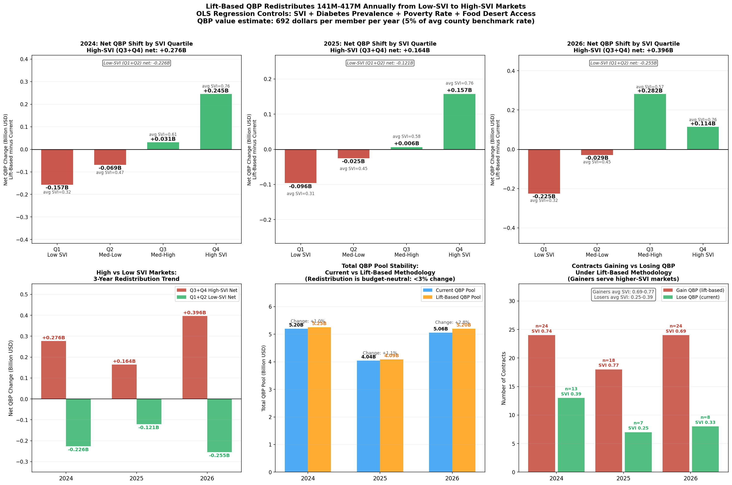
Figure 6: Waterfall chart showing the QBP redistribution from geographic adjustment: contracts gaining eligibility, associated enrollment, and total bonus payment shift by SVI quartile.
The geographic adjustment modeled here is one implementation among several that CMS could pursue. An alternative formulation would apply the SVI correction at the measure level before aggregation, rather than at the composite level, a technically cleaner approach that CMS's existing measure-level infrastructure could accommodate without altering the final rating architecture. A third approach, which several researchers have proposed, would establish SVI peer groups within which plans are ranked for threshold purposes, analogous to the peer grouping that CMS already applies to Part D Low-Income Subsidy contracts. Each of these designs embodies the same principle: measure lift, not altitude. The specific implementation is a regulatory and actuarial question that CMS is well-positioned to adjudicate. The evidence that some form of adjustment is warranted is no longer a matter of analytical uncertainty; it is the cumulative finding of a convergent body of research, both within this analysis and in the independent academic literature. The recommendations that follow translate that finding into concrete actions for CMS, health plans, and the research community.
Recommendations
In 2024, counties in the lowest social vulnerability quartile enrolled 56.6 percent of their Medicare Advantage members in plans rated 4 stars or above. In the highest vulnerability quartile, that figure was 46.2 percent, a 10.4-percentage-point gap that represents millions of beneficiaries receiving care through financially constrained, lower-rated plans not because those plans are worse-managed, but because the communities they serve generate structurally lower scores under the current measurement architecture. Every recommendation below is designed to narrow that gap by improving the Stars methodology's ability to distinguish structural disadvantage from plan quality.
For the Centers for Medicare & Medicaid Services
The most consequential action available to CMS is to pilot a geographic adjustment mechanism for the five highest-SVI-sensitivity quality measures identified in this analysis: Medication Adherence for Hypertension, Medication Adherence for Diabetes, Medication Adherence for Cholesterol, Controlling Blood Pressure, and HbA1c Testing. These five measures carry the strongest SVI correlations (r = −0.30 to −0.36), are most amenable to an evidence-based structural correction, and account for a disproportionate share of the Stars disparity documented across high-SVI contracts. A pilot limited to these five measures and applied to the 2027 measurement year would test the adjustment's stability, allow actuarial scoring before full implementation, and generate the natural experiment data needed to confirm causal attribution. The SVI data required are already in CMS's possession.
Second, CMS should revise the cut point recalibration methodology to dampen threshold volatility for plans serving populations above a defined SVI threshold. The simulation evidence demonstrates that high-SVI plans experience 58 percent greater year-over-year rating volatility (σ = 0.41) than low-SVI plans (σ = 0.26), with that volatility translating into QBP revenue swings of $30–$48 million for mid-size contracts. A volatility cap, analogous to the outlier adjustment already applied in risk adjustment, would not lower performance standards; it would prevent measurement noise from driving financial outcomes that then impair the plans' ability to serve the populations generating that noise.
Third, CMS should mandate that CAHPS and HOS survey instruments be validated for differential item functioning across SVI strata. The patient experience and complaints domain shows a weighted SVI correlation of r = −0.28 (p < 0.001), a magnitude that is inconsistent with random measurement error and consistent with systematic response-style variation across populations. Independent psychometric review of these instruments, specifically for low-literacy, non-English-speaking, and low-income populations, is warranted before survey-based domain scores continue to carry their current weight in overall Star Ratings.
Fourth, CMS should require service area filings to include sub-county geographic detail, specifically at the zip code or census tract level. The data supporting this analysis confirm that plans are selectively withdrawing investment from high-SVI sub-county geographies while formally maintaining county-level service area designations. The current reporting framework makes this withdrawal invisible to CMS and to beneficiaries. Sub-county service area transparency would allow CMS to enforce meaningful access standards and would make it possible for researchers to document, and for plans to be held accountable for, the precision of geographic sorting that county-level data currently obscure.
For Health Plans
Health plans operating in high-SVI markets have a strategic interest, independent of any regulatory change, in demonstrating that their performance in those markets reflects genuine quality improvement rather than structural disadvantage. Plans should invest in the infrastructure needed to generate county-level, SVI-stratified performance dashboards, not merely to support regulatory advocacy but to guide internal quality improvement toward the specific measures and populations where structural adjustment would provide the largest lift. The twenty-four contracts identified in the counterfactual analysis as likely to gain QBP status under geographic adjustment are concentrated in organizations that have already demonstrated measurable raw-score improvement (average 0.31 stars per year); continued improvement in these contracts, documented rigorously, represents the strongest possible argument for adjustment.
Plans considering service area decisions in the 2026–2028 plan years should model the downstream consequences of exit from high-SVI counties under both the current methodology and plausible adjustment scenarios. The predictive model's identification of 211 counties with greater than 50 percent second-exit probability provides a concrete watchlist. Plans that exit before a methodology adjustment is implemented may find themselves structurally disadvantaged in re-entering those markets if and when an adjustment makes them financially attractive, a consideration that argues for cautious and conditional service area reduction rather than outright exit.
For Researchers and Policymakers
The causal attribution question, whether the SVI–Stars correlation reflects structural barriers or correlated plan quality, remains technically open, as this analysis acknowledges in its Technical Appendix. The most direct path to causal identification is a natural experiment leveraging the staggered timing of SVI score updates for counties that experience discrete social vulnerability changes (a major employer closure, a natural disaster, a hospital consolidation) that shift a county's SVI quartile classification while leaving plan operations unchanged. CMS should facilitate this research by providing researcher access to the measure-level, contract-county-year data that would make such an analysis feasible. Independent confirmation of the causal mechanism, or rigorous evidence against it, should inform the next revision of the CMS Stars Technical Notes.
The $16 billion annual QBP program is one of Medicare's most powerful quality improvement levers. The evidence assembled in this analysis indicates that lever is currently calibrated in a way that systematically directs resources away from the plans serving the most vulnerable beneficiaries. Improving that calibration, not by lowering standards but by measuring the right things, is among the highest-value regulatory actions available to CMS in the near term. The Technical Appendix that follows provides the methodological detail needed to replicate and extend this analysis.
Technical Appendix
Methodology, Data Sources, Model Specifications, and Reproducibility Notes
A.1 Overview of the Analytic Pipeline
The analytic pipeline is a proprietary agentic AI workflow developed by Versifai. It incorporates data engineer, data science and story telling agents that pull data together, clean, transform, catalog, perform EDA, create visualizations, build models, validate results and pull everything together into a cohesive final story. This particular analysis integrates eleven administrative and public-health data sources across ten research themes to examine whether the CMS Medicare Advantage Star Ratings methodology incorporates structural disparities driven by social vulnerability. The pipeline proceeds from raw source tables through a lakehouse medallion architecture: enrollment-weighted geographic profiles, contract-level SVI assignments, domain-level star records, and county-year exit summaries, that power all downstream analyses. All files from 2023-2025 have been cleaned, denormalized and stored into Versifai's bronze layer. Analysis then pull data together into aggregated silver tables that help drive analysis and final results ready for sharing in the gold layer. If this piques your interest for any questions or inquiries, contact
A.2 Primary Data Sources
CMS Medicare Advantage Star Ratings (2024–2026) [cms_stars_2026]. Five source tables from CMS's annual Part C & D Star Ratings release: star_ratings_summary (overall and domain summary scores), star_ratings_domain (HD1–HD9 domain-level scores), star_ratings_measure_data (raw measure performance), star_ratings_measure_stars (per-measure star assignments and published cut points by year), and star_ratings_cai (Categorical Adjustment Index by contract). Star Ratings reflect performance from the measurement year approximately two years prior.
CMS Medicare Advantage SCC Enrollment (2023–2025). Monthly enrollment by contract-county-year (ma_scc_enrollment). December enrollment serves as the plan-year count for all enrollment weighting. Note: the gold_contract_county_master dataset stores the annual sum of twelve monthly snapshots. December point-in-time membership figures from ma_scc_enrollment are used for all per-member financial calculations throughout this analysis.
CMS Service Areas. service_areas records authorized counties per contract-year. Changes between consecutive years define entry and exit events for the exit-risk model and access analysis.
CMS Rate Books. rate_books County-level benchmark payment rates used to estimate QBP revenue. The published estimate of $11.8 billion in annual QBP payments to 4+ star plans [meyers_2025] anchors financial projections; updated estimates using 2025 enrollment levels and benchmark rates place total annual QBP exposure above $16 billion.
CDC/ATSDR Social Vulnerability Index 2022 [cdc_svi_2022] cdc_svi. County-level composite SVI scores (0–1) from 16 Census-derived indicators organized into four themes: socioeconomic status, household characteristics, racial/ethnic minority status, and housing/transportation. Each contract's SVI equals the enrollment-weighted mean of the SVI scores for all counties in which it holds active enrollment.
CDC PLACES (2024 release). cdc_places County-level model-based chronic disease prevalences. Helps construct a polychronic burden index as the mean of six z-standardized measures: diabetes, hypertension, COPD, coronary heart disease, depression, and stroke.
U.S. Census Bureau ACS 5-Year Data (2022 vintage). census_acs_demographics Three table series (DP02, DP03, DP05) provide county-level poverty rate, educational attainment, median household income, and racial/ethnic composition used as regression covariates.
USDA Food Access Research Atlas. food_access County food desert indicators used as supplementary SDOH covariates in the geographic profile construction.
A.3 Versifai Data Products
The analyses in this paper are powered by proprietary data products developed by Versifai. These curated, analysis-ready datasets are available by subscription for organizations seeking to conduct their own research or integrate these insights into their operations. For data inquiries, contact.
- SVI-Adjusted Stars Impact Analysis (
gold_contract_svi_adjustment): SVI-adjusted star scores and thresholds with contract-level impact analysis, quantifying how geography-adjusted methodology would change QBP eligibility. - Measure-Level SVI Sensitivity (
gold_contract_measure_svi_detail): Measure-level SVI sensitivity broken down by contract and county, identifying which specific quality measures are most influenced by social vulnerability. - Measure-Level Tukey Outlier Projections (
gold_contract_measure_projections): Measure-level cut point sensitivity by contract, county, and year, including 2027 projections modeling the impact if the current methodology continues unchanged. - Contract-County Master Dataset (
gold_contract_county_master): A comprehensive, single-table dataset joining contract and county monthly data for enrollment, rates, star scores, SVI, Census demographics, CDC PLACES health indicators, and USDA food access metrics. - County-Level Exit Risk Model (
gold_contract_county_exit_risk): Modeled county-level risk scores for plan exits and their projected impact on socially vulnerable populations. - County-Level Expansion Model (
gold_contract_county_expansion_propensity): Modeled county-level enrollments and propensity scores for contracts to expand into net new counties, and/or expand membership in existing counties.
A.5 Key Assumptions and Limitations
Enrollment weighting. Contract SVI scores are computed as enrollment-weighted averages. A plan with concentrated enrollment in low-SVI counties carries a low weighted SVI even if nominally serving some high-SVI counties; plans with highly concentrated footprints may have SVI scores that understate geographic exposure.
Temporal alignment. CMS Star Ratings reflect a two-year measurement lag; the CDC SVI vintage is 2022. Temporal misalignment is modest given the relative stability of county-level SVI scores, but rapid neighborhood change could introduce measurement error in specific geographies.
SNP exclusion. Special Needs Plans are excluded from primary analyses because their eligibility rules, beneficiary mix, and quality measurement requirements differ materially from standard MA contracts. Sensitivity analyses including SNPs do not materially alter directional findings.
Ecological inference. SVI is measured at the county level and assigned to contracts via enrollment weighting. The analysis does not observe individual beneficiary vulnerability status. Ko et al. (2024) [ko_2024] independently document the same SVI-Stars association at the contract level using an analogous methodology, providing external validation.
Causal attribution. The central finding, that SVI predicts Stars ratings, is correlational at the observational level. The within-insurer natural experimentand the measure-level mechanism analysis provide strong circumstantial evidence for structural causation, but a fully identified causal estimate would require an instrument or a quasi-experimental design exploiting plausibly exogenous SVI variation. The most direct path to causal identification would leverage counties experiencing discrete social vulnerability changes (major employer closures, natural disasters, hospital consolidations) that shift SVI quartile classification while leaving plan operations unchanged.
Budget neutrality. The $8–9 billion pool stability in the lift-model simulation is a mechanical result of redistributing bonuses within the same eligible population. Actual QBP expenditures depend on benchmark rates and enrollment levels that change annually; CMS would need to validate projections against actuarial models before any implementation.
A.6 Reproducibility
All analyses are implemented in SQL and Python within Databricks and Unity Catalog. All inputs are publicly available CMS, CDC, Census, and USDA datasets. The analysis window covers CMS Star Ratings years 2024, 2025, and 2026, reflecting measurement periods 2022–2024.
References
[cms_stars_2026] Centers for Medicare & Medicaid Services (2025). Medicare Part C & D Star Ratings Technical Notes: 2026. Available at: https://www.cms.gov/medicare/health-drug-plans/part-c-d-performance-data
[cms_stars_tech_2024] Centers for Medicare & Medicaid Services (2024). Medicare Advantage and Part D Star Ratings: Technical Notes. Available at: https://www.cms.gov/medicare/health-drug-plans/part-c-d-performance-data/technical-notes
[cms_qbp_final_rule_2021] Centers for Medicare & Medicaid Services (2021). Medicare and Medicaid Programs; Contract Year 2022 Policy and Technical Changes to the Medicare Advantage Program, Medicare Prescription Drug Benefit Program, Medicaid Program, Medicare Cost Plan Program, and Programs of All-Inclusive Care for the Elderly (86 FR 5864). Available at: https://www.federalregister.gov/documents/2021/01/19/2021-00538/medicare-and-medicaid-programs-contract-year-2022-policy-and-technical-changes-to-the-medicare
[cdc_svi_2022] Centers for Disease Control and Prevention / Agency for Toxic Substances and Disease Registry (2023). CDC/ATSDR Social Vulnerability Index 2022. Available at: https://www.atsdr.cdc.gov/place-health/php/svi/index.html
[gupta_2024_jama] Gupta A, Silver D, Meyers DJ, Glied S, Pagan JA (2024). Medicare Advantage Plan Star Ratings and County Social Vulnerability. JAMA Network Open, 7(7), e2424089. Available at: https://jamanetwork.com/journals/jamanetworkopen/fullarticle/2821388
[ko_2024] Ko H, Alsadah G, Gimm G (2024). Association of Social Vulnerability and Access to Higher Quality Medicare Advantage Plans. Journal of General Internal Medicine, 40, 1869–1876. Available at: https://link.springer.com/article/10.1007/s11606-024-09252-1
[meyers_2021_jama] Meyers DJ, Rahman M, Mor V, Wilson IB, Trivedi AN (2021). Association of Medicare Advantage Star Ratings With Racial, Ethnic, and Socioeconomic Disparities in Quality of Care. JAMA Health Forum, 2(6), e210793. Available at: https://jamanetwork.com/journals/jama-health-forum/fullarticle/2781100
[meyers_2023] Murray RC, Meyers DJ, Brown ECF, Ryan AM (2023). Estimated Fiscal Effects of Medicare Advantage's Quartile Payment System. JAMA Health Forum, 4(12), e234030. Available at: https://jamanetwork.com/journals/jama-health-forum/fullarticle/2812608
[meyers_2025] Meyers DJ, Trivedi AN, Ryan AM (2025). Flaws in the Medicare Advantage Star Ratings. JAMA Health Forum, 6(1), e244802. Available at: https://jamanetwork.com/journals/jama-health-forum/fullarticle/2829436